Worked example: from a Google Form to a report
This end-to-end example takes a survey export all the way to results pasted into Word. It mirrors a real workflow; adapt the column names to your own study.
Imagine a short survey with questions including: age, monthly income, a test score, an overall satisfaction rating (1–5), whether the person passed an exam (Yes/No), gender, region, and a “which features do you use? (select all that apply)” checkbox question.
1. Import the export
File ▸ Open… and select the Forms
.xlsx.Open the data viewer to confirm the columns loaded and check their types (numbers as Numeric, text as Nominal). Note that the app added an ID column at the front.
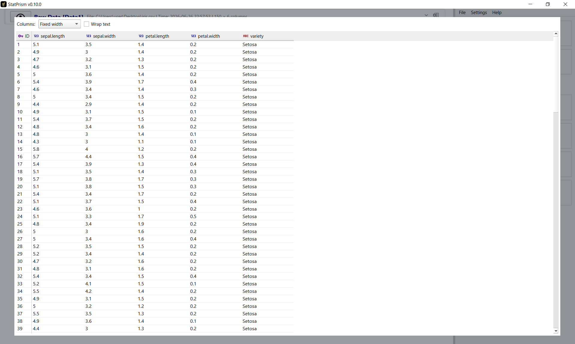
Step 1 — the imported data in the data viewer, with column types and the added ID column.
2. Clean the data
Add the processing steps you need (each becomes a card in the chain):
Impute Missing on income with Median, to fill the few skipped answers.
Filter to drop test rows — for example, keep only rows where age is not empty.
Outliers (IQR) on income, if you want to exclude extreme values. Toggle it off later to compare.
Response Quality to drop careless respondents — for example, those who straightlined the rating grid or skipped most questions.
Preview any step to see its effect (removed rows show in red). Steps that remove rows (Filter, the outlier steps, Response Quality) list the flagged IDs as checkboxes — untick any to keep that respondent.
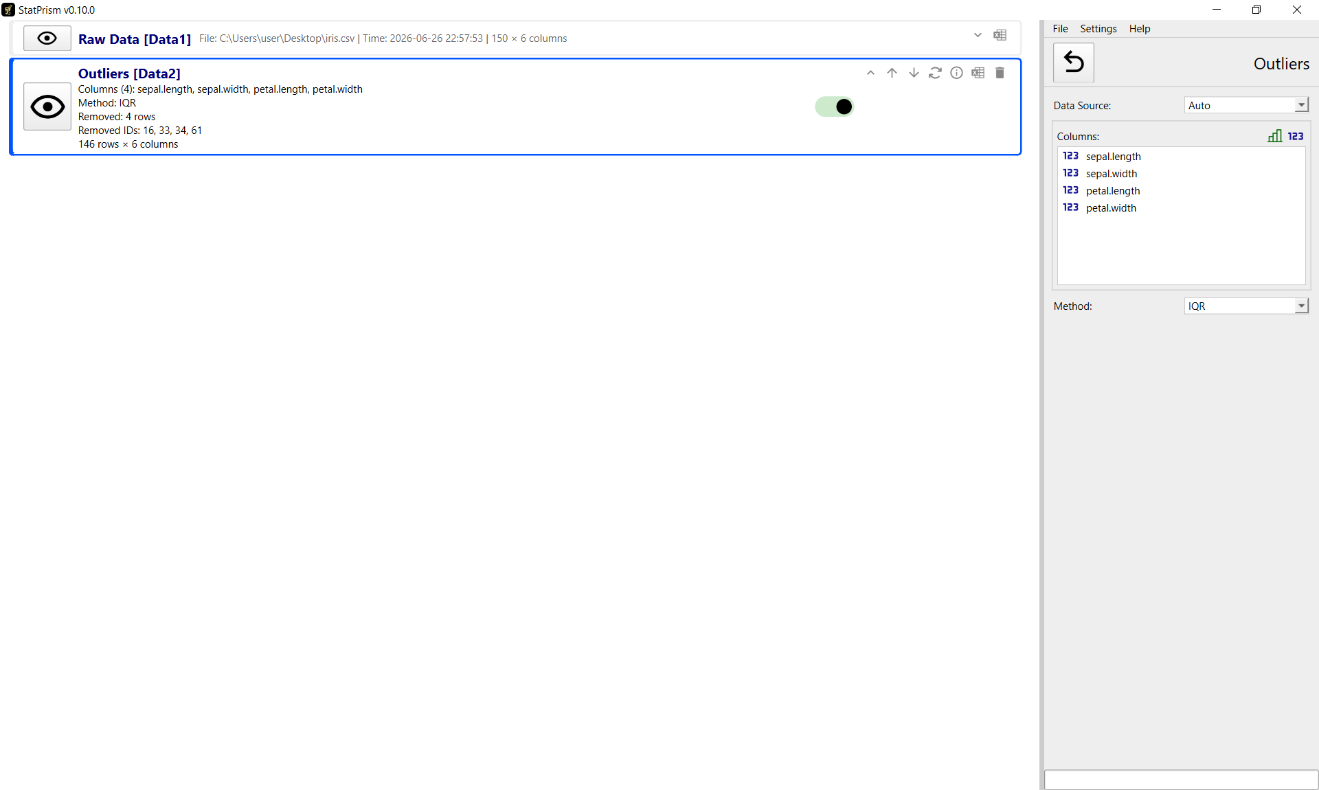
Step 2 — cleaning steps stacked as cards in the chain; each feeds the next.
3. Build derived variables
One-hot encoding on region → 0/1 indicator columns, so region can enter a regression.
Split Multi-Select on the features question → one 0/1 column per feature.
Calculate Scale if you have several items that form a scale (Sum or Mean).
4. Run the analyses
Pick modules in the settings panel on the right and choose the relevant columns:
Descriptive Statistics on age, income, score (add a histogram and box plot).
Correlation among age, income, score (Pearson, with confidence intervals).
T-test/ANOVA of score by passed (Yes/No).
Regression predicting score from age, income, and the region indicators.
Multiple Response on the split feature indicators.
Each result appears as a card on the left and updates if you change the cleaning steps.
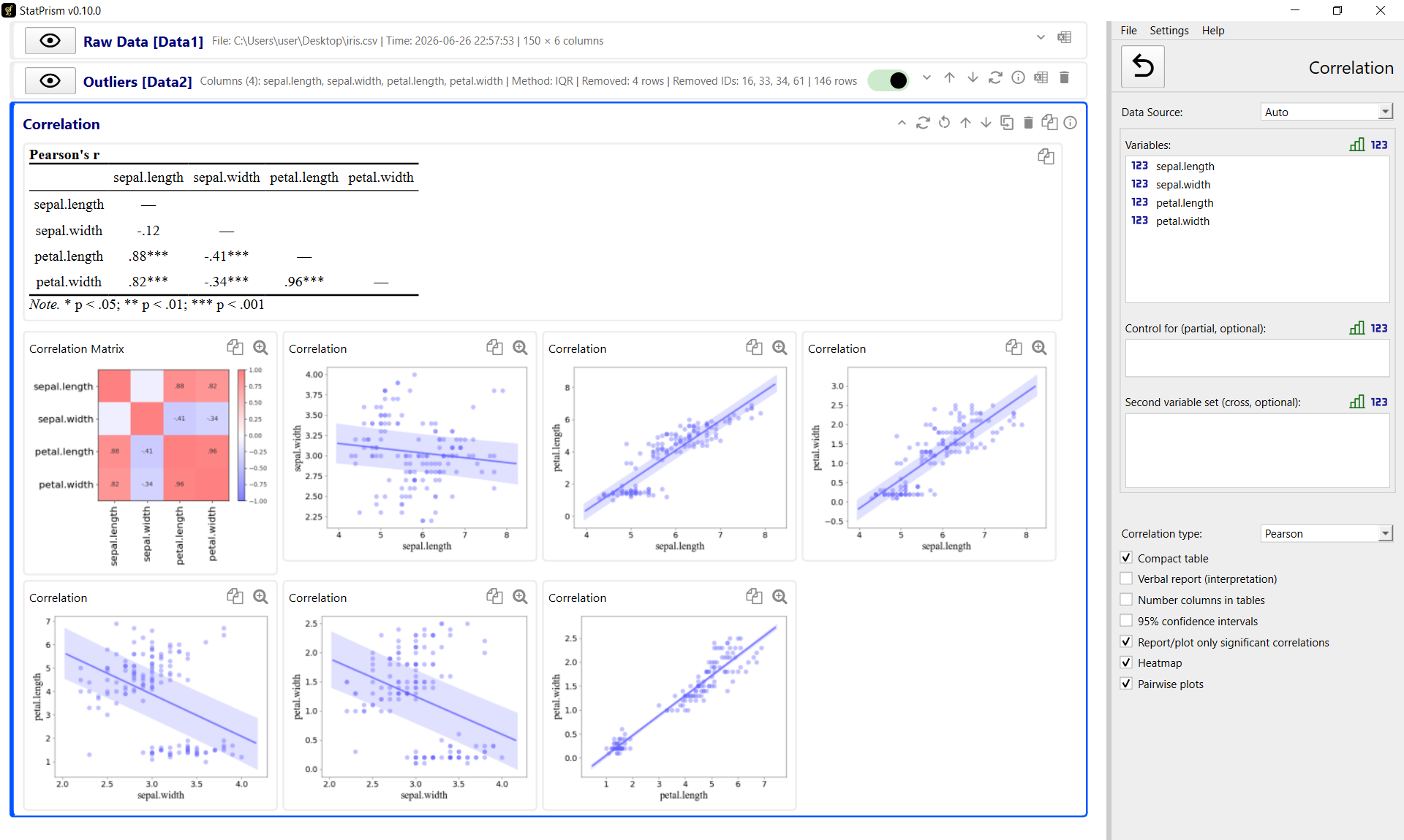
An analysis configured on the right, with the resulting cards (tables and plots) assembled on the left — ready to copy or export together.
5. Get it into your document
Choose your Language (Settings ▸ Language) and Plot theme (Settings ▸ Plot theme).
File ▸ Copy All Results, then paste into Word — tables arrive as editable tables, figures as images. (See Results & export for the paste tips, including removing Word’s paragraph indent so tables line up.)
Or File ▸ Export Report (HTML)… for a single self-contained file you can archive or print to PDF.
6. Save the project
File ▸ Save As… to a .sp file so you can reopen the entire session — data, steps, and
analyses — later.
That’s the whole loop: import → clean → derive → analyze → export. Once it’s set up, re-running with new responses is just re-importing and letting the chain recompute.